Tableau Program Distills COVID-19 Information from Johns Hopkins
Data from 190 countries was pouring into the Johns Hopkins database tracking the virus since December, but it wasn’t easily digestible. The Tableau company decided it needed to help out, and has done so since February. Mapbox, Path, Snowflake, DataBlick and Starschema have worked with Tableau with the project.
“But all that data, which was being entered into a web dashboard created by the Center for Systems Science and Engineering at Johns Hopkins, was messy and hard to use for most people because it was in multiple formats and required a lot of clean-up work to make it understandable,” said a story on techrepublic.com.
One is example is that data from both the Vatican and The Holy See were reported, which are from the same place.
Steve Schwartz, Tableau’s director of public affairs, said, “As you can imagine, when you bring in data from some 190 countries, you also bring in data from sub-agencies and more. It has a lot of potential for double-counting, different naming conventions, and language differences” when it is all brought into a single data set.
Four Tableau “Zen Masters,” Anya A’Hearn, Tamas Foldi, Allan Walker, and Jonathan Drummey, have led the effort to clean up the data.
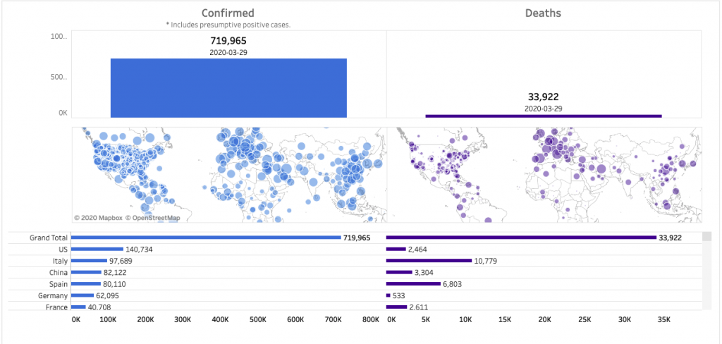
Tableau started its own dashboard, giving users a place to begin to find the coronavirus statistics and information from details on the number of confirmed cases and deaths from COVID-19 in a wide range of countries, along with related metrics.
The Tableau COVID-19 Data Hub provides even more data from other sources on the effectiveness of social distancing, the effects of the pandemic on restaurants, detailed country and state maps, and much more through a COVID-19 Data Visualization Gallery.
read more at techrepublic.com
During this pandemic, trusted and timely information is essential to making decisions for your employees, loved ones, customers, and community. Together with @Tableau, we’ve launched a free resource page on the Coronavirus and the public health response: https://t.co/baGkdGzyg6 pic.twitter.com/Hvr5wGGEcH
— Salesforce (@salesforce) March 18, 2020


Leave A Comment